
Our World Is
Data-driven,
So Is Your Business.
( Note: Real product name, typeface, and data have been replaced. )


An up-to-date overview of foreign brands' online store performance in China's e-commerce market.
Role | UI design, User research, Design style guide, Information architecture, Visual design
Team | 1 Product owner, 1 Designer, 4 Engineers
Field | E-commerce, Data visualization
The Challenge
Inability to integrate data from multiple platforms and Chinese Tmall backend make it hard for non-Chinese speakers of foreign brands to monitor the performance of their online store and social media channel.
The Outcome
A dashboard not only provides brands with an in-depth cross-analysis of their online store but also allows our staff to easily manage different brands.
1. Features Walkthrough

2. Background
Complexity in data integration, data analysis and language translation
Compared to setting up physical stores, setting up on a Chinese e-commerce platform such as Tmall and Taobao is an easier way to tap into the local market.
However, inability to integrate data from multiple platforms and Chinese backend interface makes it hard for non-Chinese speaking users to monitor the performance of their online store and social media channels. Also, it is a time-consuming routine for our staff to deliver daily reports that integrate data obtained through API and collected manually from Tmall backend.

3. Solution


Introducing Dashboard
Dashboard is not only a data dashboard that allows non-Chinese speakers of foreign brands to have an overview of their online store performance at a glance but also a systematic tool for our staff to manage different brands easily.
I. data integration
and data analysis
II. Daily report of store performance via email
III. Role-based
access control
IV. Easy access
from all devices
V. Customizable
user interface
3.1. Data integration and data analysis
Target market trend statements from multifaceted analysis reports are generated to help foreign brands with project evaluation and decision-making.

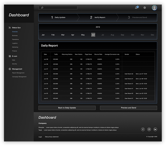
3.2. Daily report of store performance via email
An up-to-date daily report showing online store performance is emailed to brands' managing directors and account managers on daily basis after the data integration ( through API and manually updated by the staff of oddity Asia )
Integrating data that is automatically updated and manually updated
Daily report emailed to managers of foreign brands


3.3. Role-based access controls control
From managing directors to account managers and from users of foreign brands to staff of oddity Asia, there is a wide range of target users for Insights. A role-based access control is a mechanism for our security administrator to decide who can access what functions on the platform. Therefore, security of sensitive information is easily maintained.


3.4. Easy access from all devices
Insights comes in desktop and mobile version. The desktop version can be used to handle more complex tasks such as daily report manually update and set-ups of dashboard while the mobile version is designed for monitoring real-time store performance.
3.5. Customized user interface
A customized user interface design based on CIS of different brands provides users with a better user experience.
Brand A

Color:


Color:
Brand B

4. Iterative Development & Design
Guided by scrum and a highly interactive user-centered design process
We shape Insights into a tool for foreign brands to better understand Tmall ecosystem by discovering their needs through weekly user testing meeting.
Planning
Data-analysis &
Back-end
Implementation
Front-end
Implementation
Inner
Experimentation
Weekly
User Testing Meeting

Refinement
UI & UX Design
About 1 to 1 and a half Month
5. Design Process
The following design process makes sure that every design decision was supported by user research and feedback.
1
Empathize & Define
Interviewing 10+ keymen and defining their problems
2
Ideate
Planning and research
3
Prototype
Low-fi and high-fi Prototype
4
Validate
Reviews and feedback
Visualizing details to spark new ideas
Usability testing reveals insights to refine problems
5.1. Empathize & Define — User Interview
Insights is not only a dashboard providing online store performance to foreign brands but also a platform for our account managers to integrate data that will be sent to the client through daily reports. To fully understand both everyday workflow of our staff and KPIs of each brand and clearly define their needs, we use task report to list everyday work of our staff and use level of satisfaction to prioritize their paint points.


According to the interview with our staff, “daily report” is a time-consuming everyday work with the lowest satisfaction level.
Also, Jobs to be done framework is a helpful tool for our teammate to align with each other at the debriefing session after each interview:

An overview page with both KPIs the brand cares about and a project evaluation is needed.

A daily report management page with data obtained through API and manually update is needed.
5.2. Ideate — Competitor Analysis & Planning
As a Chinese proverb states, "Know yourselves and your adversary to win a hundred battles." To find the gap in an established dashboard market and become a dominant market player, we analyze the pros and cons of our competitors ( 阿里數據—生意參謀, Amplitude, Mixpanel, Google Analytics..., etc ). After identifying the market gaps, we fill them by planning our product accordingly. And here comes Insights — a more tailor-made dashboard for non-Chinese speakers of B2C foreign brands.


Analyzing our competitors ( Amplitude, Mixpanel and 生意參謀 ) to find the market gap
Functional map of Dashboard


5.3. User flow and Prototyping
In the design process of each scrum, user flows or wire flows are used for better team discussion and communication. By mapping out every step the user takes, the team can go through what the user will see and do while performing a specific task. The step-by-step breakdown is also extremely helpful while creating data entry and data processing user interface.


High-fi prototype is used for testing the consistency of UI elements and for better discussion of transitions such as a popup alert box or a progress bar.

5.4. Validation & Problem Solving
One of the tough situation we encountered is the email template of daily report. It is instructed by our stakeholders that there should be break down tables and charts in our email template whereas email is not a good choice for inputting complicated contents and tables with 6+ columns because email is not a responsive device and it only consists of HTML and CSS. Because of the technical constraint, we use empathy map to help them understand whom will receive the email — Managing director and account managers of the brand. Since email is not suitable for breakdown tables, we only keep what both managing director and account managers needs in email — charts of major indicators. With the major indicators, there is no need for users with limited time to pinch in to checkout detailed information. Instead, they can comprehend their online store performance at a glance. For detailed breakdown tables and raw data, users can go back to Insights through a link at the bottom of this email.


Before: Original email template with raw data
Refinement: Email template with KPIs and major indicators


6. Building The Foundation and System
To enforce the consistency throughout the product and to make it easier for front-end developer to build reusable components with React js, a GUI guideline is essential to this project:


7. Presentation
At the end of first sprint, me and the product owner pitched to our potential clients. This presentation not only gave me a chance to plan for the branding of Dashboard but also help us make sure that Dashboard aligns with business model.
