
Objective
1. Redesigned recruitment websites of management associate program.
Unified and simplified the structure and design of three management associate recruitment websites ( management associate, technology management associate, and trading management associate ) which were originally designed with inconsistent design pattern.
2. Optimized user experience of the recruitment websites.
To ensure the websites accurately convey E.SUN’s design principles of simplicity and user friendly, I simplified the user experience according to data of user behavior collected from current recruitment websites.
Role & deliverables
1. Refined UI and user experience according to E.SUN's new design system.
Refined overall visual style and unified UI components of three recruitment websites according to E.SUN's newly established design system and also made sure the refinement was align with the bank's design principles of simplicity, clearity, and user-centric.
Built responsive websites enabling users to check the recruitment information from different devices.
1. Features walkthrough


2. Background
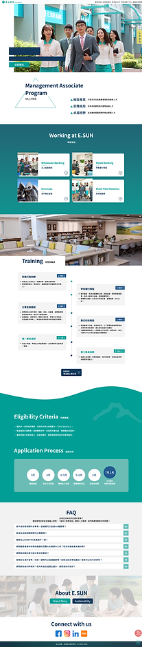
Recruitment websites with different styles, inconsistent structure and complicated user flow.
Original management associate (MA), technology management associate (TMA), and trading management associate (TA) recruitment websites were designed and developed by different teams at different time. Initially, department of human resources planned to optimized TMA and TA recruitment websites according to MA recruitment website that was just redesigned last year. Meanwhile, design principles and a design system of E.SUN bank aimed to optimize user experience was established. To make the best out of this recruitment website refinement, I proposed to department of human resources with an advanced design concept that not only unified design style holistically but also simplified structure and user flow across three websites according to E.SUN's design principles of simplicity and user friendly.
Original MA website
03 Solutions

Original TMA website

Original TA website

3. Solutions
First ―
Unified overall visual style and UI components across three websites
To provide applicants with clear introduction of E.SUN bank and give them better user experience, I unified UI components and simplified user flows of MA, TA and TMA websites. Since application of color was regulated by the bank's newly established design system, common websites such as E.SUN's official website and recruitment websites took bluish green, the brand color, as their main color scheme to better express brand image. Also, I unified the structure and all components of three websites to not only ensure design consistency but also allow myself to develop three websites systematically and more efficiently.
Refined UI with two key vision proposals of three recruitment websites :
Concept 1


Concept 2


The reason why the application of color and UI design of three recruitment websites were simplified :
Just before the refinement of the recruitment website, design principles of simplicity, clarity and user-friendly and design system regulating UI components of the bank's digital products was established to ensure every project team create user-friendly and unified products providing clear introduction or efficient guidance to our customers. Therefore every designer was required to express the spirit of design principles to stakeholders and ensure the product was developed in accordance with the bank's ultimate vision of optimizing user experience.
Second ―
Optimized the user experience of recruitment websites
I simplified the user flow from landing page to experience sharing page and reduce the length of each experience sharing post of MA recruitment website because the bounce rate was above average ( about 49% ) at experience sharing page according to data of user behavior collected from current recruitment websites.
In addition to the effort it took from landing page to experience sharing page, users were less likely to relate the categorization of this page to the introduction on landing page because they have to keep all information about the categorization in their short-term memory in order to figure out tabs and the four categories ( Wholesale banking, Retail banking, Overseas, and Multi-field rotation) on experience sharing page.
Problem 1
Applicants couldn't find the experience sharing of current employees in an efficient way and were confused by the categorization of those experience sharing posts.
A. It took more than 3 clicks from the landing page to take users to their goal.


B. Users have to memorize all information about the categorization on landing page in order to figure out the difference between tabs and the four categories on experience sharing page.
The bounce rate of mobile users was about 49% on experience sharing page.
Problem 2
A. Browsing over a long website to finish reading experience sharing posts of one category led to high bounce rate at this page.

B. It took a lot of effort to scroll up and down the web page to read the experience sharing of different categories.

Solution: Provided user interaction with no extra clicks and reorganized the websites' structure to avoid lengthy web pages.
The optimization aimed to optimize user experience on mobile by reducing complicated navigating and time-consuming browsing was implemented since around 70% of users browsed over the recruitment websites on mobile.

